Monday, April 4, 2011

Fashion Forward: A new Palette at Last!

Welcome April, and warmer weather!  Fashion forward sticks to its name and continues on through the seasons, heading into Fall 2011.  And where better to turn to first than Pantone, the paterfamilias of color trends?  Here's their color palette for the autumn season: (all images copyrighted to Pantone and Mountain Glass)

Note Honeysuckle is still clinging to its title of Color of the Year.  I'm a huge fan of pairing it with the Bamboo and Emberglow (what a name!), it's a nice transition from summer to fall.  It takes the brighter, flashier corals and yellows of summer and tones them down for the fall.  The Phlox color is a gorgeous purple, and pair that with gold accents.  Cedar and Deep teal will look great paired with the neutral hues, and Quarry with Orchid Blush is an icy slide into Winter.  The only color I think is missing is a warm red, and many of the fashion designers agree. 
Pantone has a fabulous set-up with links to interviews with fashion designers and their trend/color selection for the fall, and Rebecca Taylor believes Bordellos and Burnt Siennas will be go-to colors this season as well.  The complementary color of red is green, and since the bordellos are not true reds, go with a not-true blue like the Dark Teal. 
If you're a glass artist, here are some colors that correspond to the trends:
"Bordello" from Messy Color.  It's a striking red, and can be a super fussy color, but the red is so rich and deep and darker than plain red.  It's one of my favorite colors, and I normally don't work with warm colors very much.  But this, paired with gold accents, will be gorgeous.  It makes you want to fill your glass with red wine, nestle into a fuzzy blanket, and sit by the fire. 

"The Great Bluedini" by Messy Color (I love that company!".  I can't think of a better color for the Dark Teal tone.  It's thick and can pucker if you hold it too long in the flame, but I love the slight transparency to it.  Put it over one of the more neutral colors, like the silver gray, for a spectacular effect. 

"Rubino" by Moretti.  It's a popular transparent color of gold and ruby tones, and looks wonderful in Fall and Winter pieces. 

It's basically the big shift from bright, light, and fun colors of Spring and Summer to deeper, richer, warmer colors of Fall and Winter.  I don't know if it's the same for those who live in places without seasons, but the colors reflect the shift from longer days to longer nights, from blooming trees to stark branches.  I'm excited for the change, I was getting tired of the pastels.  On to something with a bit more bite, and a totally new color palette. 

Next week will cover the fashion trends, and how to design jewelry with them in mind. 

Wednesday, March 30, 2011

Island Girl Rocks!

I fell instantly in love with this next artist as soon as I saw her awesome stamped clay designs.  IslandGirlPottery uses her own stamps that she's made to create beautiful patterns in clay and then, with multiple firings and processes I don't understand, generates astounding colors.  Her love of life is reflected in the simple, natural designs that are full of vivid personality.  I'll admit, part of the draw for me is the cuneiform look to her pieces.  They look like the cylinder seals the ancient Sumerians used, and that texture that goes along with that sort of design is so tactile you can feel it through the pictures.  (all images copyrighted to the artist)

The colors are gorgeous; I see this on a glass table in a house with all windows right on the ocean.  Her stamps are whimsical and fun, the animal stamps wonderfully framed.  You can never have enough dishes this size, by the way.  You always find a use for them.

The purple color of this caught my eye instantly.  These are "trinket" dishes, and I like how you get two of them in a set.  Again, can't have too many of these either!

If you see that unusually shiny and reflective surface on part of it, that's actually recycled glass.  What an awesome touch, and I personally haven't thought of combining clay and glass.  It creates a fantastic effect, gives the eye something unexpected. 

She also makes these utensil holders, and they can double as holders for anything you might need; knitting needles, pens and pencils, glass rods...the list is endless.  That gorgeous green color will brighten up any room.  her curly-que stamps are so neat, and look great on all her pieces. 

IslandGirlPottery has tons of other items; click here to start browsing!

Tuesday, March 29, 2011

Twisted River Clay

The first foray into clay!  I can't believe I've gotten this far without doing a post on this fantastic, and popular, art form.  TwistedRiverClay jumped out at me right away.  Their simple, curvaceous designs, geometric patterns, colors, and sweet touches result in beautiful finished products each time.  They have a wide variety of items available besides the usual bowls and cups, and even their bowls and cups have unique designs.
(All images copyrighted to the artist)
Always a winner with the folks, and this puts a very personal touch on it that only a handmade gift can convey.  I really like the style of font, and the bulge in the middle of the cups feel very nice when you hold it with both hands.  Very homey, warm and comforting.  The colors are lovely, that speckled bottom looks great with the brown, and the middle color smooths the transition between the two. 

How cool is this?  I have never seen anything like it before.  It's a planter - how fun would this be to look at?  I like how they made the texture of the wood, and the little birds are so adorable. 

A vase with a little bird on the top.  They have such cute touches that make all their items appeal to your heart.  The colors in this piece are wonderful; they are excellent at transitioning from one color to the next and only putting analogous or complementary colors next to each other.  For me color is so important because, if you're going to be looking at this item all day, it has to be more than pleasing to the eye.  Clashing colors, or strange mixes, will get old fast; but all of these items have timeless color combinations.

I ADORE this idea.  The tree texture really makes it look carved.  The nostalgic, romantic quality of this simple idea is perfect.  Men, if you're reading this, I can tell you any woman would swoon if you brought this home for a birthday, anniversary, or, even better, no reason at all.

This is just a slice of what TwistedRiverClay creates.  Click here to check out their Etsy shop and view the rest of the fabulous items!

Monday, March 28, 2011

Fashion Forward Summer 2011: Hottest Jewelry Trend

Fabric Jewelry  = Hot

The hottest Summer 2011 accessory trend according to Elle? Fabric jewelry.  Woven, threaded, braided, plaited, tied, knotted...anything that's soft, supple and colorful.  I'm on board with this, and have already been experimenting braiding leather cord and attaching a single focal bead.  It looks super chic and very biker-esque. 

Not to mention the fact that using fabric opens the door to a male clientele that might not have been so fond of silver chain and lots of pearls.  The looks can be made into rugged, basic colors that men like.  Add a small focal bead with gunmetal and silver, maybe throw in a geometric design, and you have an androgynous piece that will appeal to both genders.

Back to Elle- here's a few of the looks that they have on their fabulous website (all images copyrighted to Elle).
The perfect example for the summer:  bright, fun, spunky, vivacious and, above all, simple.  If you're making your own, just braid a few colors of thread/ribbon/yarn together, make a wide-hole bead (or buy one), and you've got your super-easy necklace.  The suppleness of fabric always looks good on the beach and with light, breezy fabrics that are popular during the summer.  It reflects the mood of the season, when we all feel a little more relaxed and care-free. 

This one mixes and matches different fabrics, and it's an awesomely trippy look.  I think of surfers and the beach, but that's just me.  Again, thread on a large hole bead and you're good to go.  Or, you can try attaching a bead between each color change.  Another popular look is the off-center necklace; put the focal bead high up on the left or right sides.  Just remember, if you're changing colors to often, to keep one thread of similarity running through the necklace.  Here, they kept a white/off-white color throughout the whole piece to tie it together.  Otherwise it might come off as too kooky and eccentric.  Not to mention it wouldn't really go with anything :)
You can get really creative with knitting.  I'd love to see lots of small beads woven into the stitches and hanging off the ends.  Or you could go with one large focal right in the center.  And i have to mention the purple and gold - third Fashion in a row that mentions it!  Also note that they kept the gold down to just one thread rather than putting it all over the place.  I'm a big believer in using more than one shade of a color in the same piece, and in this that works very well when using the gold as an accent.  Keeping gold and silver to accents is always a chic touch. 

This snake-like necklace is fabulous!  I love the idea of wrapping it around multiple times, and that is much easier to accomplish with fabric than it is with string, wire or chain.  Check out the perfect spot for a focal bead, right at the end.  It'll look lovely dangling down from the choker-like necklace. 

Check out the Elle website for tons, and I mean TONS of fashion advice, trends, and updates.  This one little accessory trend is just the tip of the Elle Iceberg!

Thursday, March 24, 2011

Etspiration Thursday: QuercusCreations

Our new Etspiration Thursday artist fills his canvas with images of beauty in all forms.  Using expert photomanipulation skills, digital finesse, and the art of photoprinting, QuerusCreations melds textures and prints together to form a new definition of beauty.  His keen eye for creating nostalgic, romantic textures mixes with a love of color to create a portfolio of half-remembered dreams.  His images are blurry at times, starkly colored in others, but all evoke a sense of memories past, when they seem sweeter than they did in the present.  (all images copyright to the artist)

"The Thaw" - I absolutely fell in love with this image.  I am very interested in natural processes of the earth and how this is beauty in its most basic form, and here the artist has explored exactly that theme.  Taking something so mundane as the frost melting from the leaves, he has created an image both beautiful and haunting.  He layered different images of ice melting, and the result is stunning.  I am very impressed with how he creates incredible mental depth to his pictures by having the layered textures be similar to the theme of his pictures; here, the textures are layered prints of ice melting because it pertains to the theme of the picture.  The depth that these layers create are wonderfully rich and heavy.  You can feel the leaves beneath you fingers, the dampness, the cold.  But he has manipulated the colors so that there are spots of warmth within the chilliness, and you truly get the sense of melting.  He has also avoided overdoing the textures.  You can still make out individual leaves, but they're just blurred enough to make it seem abstract.  It's a fine line between the suggestion of a theme and a hodge-podge of nothingness.


"Swans".  I adore this photo because of its timeless quality, the romantic atmosphere, and a slightly nostalgic feel to it.  He's put in just the right colors; nothing disturbs the senses or seems out of place, and they highlight the paleness of the swan.  The eye is drawn right to the mother, and from there naturally follows down to the ducklings.  He's almost hidden them from view, which I like; a sense of discovery in a piece is always appreciated.  Again, he's layered prints of water on top, which have to do with the theme of the picture.  The artist has such talent at creating a gritty, grained texture. 

"The Archway" - this time he used digital manipulation rather than layering of prints to create the effects, part of his "photopaintings:".  The darkening of the trees in the front is brilliant, as it allows the background to come into its own, highlights the fabulous interweaving of tree limbs, and creates a greater sense of depth.  One of the hardest things, I find, is creating a three-dimensional effect in a two-dimensional world.  When you can add just a little touch that helps converge the two, it has a powerful impact on the image.  The grainy texture he used over the whole piece is also great because it makes me think of sunlight slicing through the trees, like you see when the forest canopy is very dense.  You get that same streaky effect.  He's also been able to capture a very fine-art quality in the picture, making it look more like a painting, especially with the tree in the center of the background.  For some reason I imagine that in a Renaissance painting of a Lord and Lady out for a picnic :) 

A man of many talents, QuercusCreations also uses photoprinting techniques like using wax and paper that doesn't absorb all the ink.  He also offers greeting cards!  Click here to start browsing his Etsy shop!

Monday, March 21, 2011

Fashion Forward Summer 2011: All Choked Up

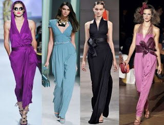
I don't know if it's because I just made a choker this week or it's going to be an actual fashion trend, but I I see the potential for some serious neck action this summer.  Judging from In Fashion with Barbara Glass, a very informative blog by a woman who is a fashion expert, it looks like high scoop necks and low-cut V necklines for the summer.  She also has great pictures of the various trends on her site, listing the Top Ten in her opinion, and has a daily blog where she runs all fashion all the time, including some interviews (all images copyrighted to InFashion blog and their respective creators). 

This is the picture, the one on the far left, that gave me the choker idea.  Make it a thick one, with some fun dangly pieces, and it becomes part of the outfit.  I like how that picture has a fabric strip at the top - mixing textures and materials always make for a more interesting look, and has an edgy, hip aspect to it.  In the summer that frayed, relaxed, tossed-together took is very popular, especially while on vacation. 
If you have a short neck and think a choker will make it disappear altogether, then I would have a thinner strip with lots of sections hanging off of it that almost make it as long as a regular necklace.  This will naturally lengthen your neck. 
Note that a choker will look good with all of these short necklines.  I find it very hard to make items that go well with this sort of look, and I'm going to try out more chokers this year.  Some poeple think it's a "young" thing or a "punk" style, but I think it can go well with anything if done right. 
I adore purple (as my last Fashion entry said!), and this color palette, whether done on purpose or not, is one of my favorites.  Two shades of purple, throw in the blue as an analagous color, and a dash of black to bring it all back to center.  What it looks like is that ribbons around the waist are also going to be popular, and you can work that into your jewelry by including an actual ribbon element.  Try making a necklace with big chain and then threading thin ribbon through the links. 
The ribbon look will also go well with a piece that mimics the placement of the bow: have a necklace that is fairly uniform and flat except for a section off center that is the focal point.  Have a large bead there, a burst of color, something that sets it apart and draws the eye, like the big bow on the ribbon belt. 
And again, chokers will look good with this - check out the second from the left, and just imagine that scarf as a necklace!

Thursday, March 17, 2011

Etspiration Thursday - Bruno Photography

Etspiration Thu--no, it's almost Friday!  Sorry about the delay, I've been busy getting ready for the trunk show at the end of the month. 

Continuing with the March theme of photomanipulation, we've got a fine art photographer who also produces beautiful photomanipulation using layering and textures.  Bbrunophotography has archival quality prints of nature, household objects, and animals.  Beyond that, she has gorgeous, innovative abstract designs that are created from original photos manipulated to the max.  Incredibly mesmerizing with perfect color combinations (and names for colors - I had forgotten Eggplant was a color until I looked through her prints!).  Her textured pictures have a gritty, real feel to them, and the flowers looks real enough to feel the softness of the petals.  She's got an eye for detail, angle, and color. (all images copyrighted to the artist)

"As the Crow Flies" - featured on her home page, as it very well should be.  The mood in this piece is fantastic, and she creates it with the darker ground, lighter top, and the bird being the blackest part of the piece.  He really stands out, even in the darker areas.  The texture of the map on the background, also an ingenious play on the title of the picture, gives it a rough, solemn ambiance.  I imagine this crow looking out over a vast field, thinking of the long voyage ahead with a bit of trepidation and steeling of nerves.  That can apply to most of us at some point in our lives; another reason this picture captures the attention.  One sympathizes with the crow. 
"After the Rain" - Not only is this a gorgeous shot of the flower, but the simplicity of the texture is what caught my attention.  She only textured the delicate raindrops.  Instead of going for a complete reworking of the whole piece, a layering and layering of texture over texture, she just lightly brushed on spattering of texture in the right places and voila - you have a beautiful piece of artwork.  Many of her pieces boast this eye for the perfect touch.  She can manipulate the art in such a way that it looks untouched, yet more enticing than in life.  I also have to note that she has the grid system down pat.  I only know a little bit about this, but the key is not to put your focal point in the dead center of the picture.  You divide the canvas into nine sections with four lines, two going in each direction, and then place your focal to the side, out of the center boxes.  Bbruno is great at placement.  It's easier on the eye, less abrasive, and lets you gently observe the piece instead of having it come rushing at you. 
And - last thing, I promise - the colors are wonderful.  The ivory with the dark background is simple, elegant, and eye catching.  She often uses two colors that complement each other. 
Speaking of complementary colors..."Mustard and Teal Abstract".  Remember I was telling you about the abstracts?  This one started out with a picture of a sunflower and she morphed it skillfully into this mesmerizing piece.  Mustard and Teal are unusual choices to put together, but they work extremely well.  She has enough variation in the shades of the colors to stop the work from becoming overly bright.  This sort of design also has the potential to cause a headache, but she hasn't overdone the layers, alternates the colors softly enough that they meld into one another, and has made the center the focal point.  Everything seems to radiate outwards, allowing the eye to follow a path instead of see-sawing back and forth from point to point.  It also reminds me of a Mandala (I think that's how you spell it), and would look lovely in a yoga or exercise room. 
"Urban Cornflower" - I love this idea!  She's put a flower with a grunge metal background.  A combination I wouldn't have thought of, but she kept the colors light and Spring-ish to counteract the metal background.  The result is much softer than a grunge picture would normally be, and I like it.  I love the rivets going up and down the sides; they sort of encase the flower, and give the eye a path to follow naturally up and over to the flower.  The faded feel to the colors adds to the overall ambiance, and that light blush of pink in the upper right hand corner is perfectly placed.  If you look closely, you can also see a bubbly texture over the flower - I like how it makes the whole scene appear under water.

Bbrunophotography has a deep love of nature that manifests itself in her artwork in a myriad of ways.  She's let her imagination mingle with her passion for photography and the world around us.  As if that weren't enough, she also writes children's books and greeting cards!  Click here to check out the website for those items. 
Click on over here to see the rest of her artwork, and I can assure you there's plenty to keep you occupied for hours!