Attention: Great news! I am going to have my very first ever Trunk Show on April 1 (they better not have been kidding about it!)!
It will be at Accent Studio in Haddonfield, NJ. They run a "First Friday" program, and I'll be the First Friday in April. So if I miss some entries in the coming month, it's because I'll be working industriously on my line. Please join in the fun if you're in the area: it will be from 5 to 9 PM, and many exciting items that are NOT in my Etsy store will be there!
**We now return you to your regularly scheduled programing...**

Monday, February 28, 2011
The Refinery
Nope, not the kind of refinery you're thinking about. This is one for distilling pure pearls of fashion wisdom from the plethora of media coverage and runway shows. The Refinery is a fabulous website dedicated to short, succinct wrap-ups of fashion events and coverage. The link above will take you to their trend pages for Spring 2011; they have a great 6-page line-up of the hottest colors, which include the ever-fashionable Honeysuckle, a buttery yellow, orange, white, blue and earth-tones. It matches up well with Pantone's colors. This is going to be a short and sweet article as well, not much time this week to muse over colors! (all images copyrighted first to their respective fashion designers, and then to the Refinery (I think that's how it goes? I just know they're not mine...))


This is their "earthy" tones, and I love them. I am not a fan of bright reds and oranges, and this tones them down enough for my eyes not to hurt. I think adding in a hint of a dark cool color, like a stoney blue or green, or even better a gray stone laced with those colors, would look gorgeous in any jewelry. Browns, ambers, and antiqued golds should form the large chunk of color in the pieces. Copper accents would be perfect, and help ailments (just a plug for the health benefits of copper!).
On a general note, I'm feeling copper as the new findings favorite for this year. I think we've done silver and gold to death, and people are looking for something hip and new. Gunmetal and black findings are on the horizon as well, though more confined to the "trendy" young pieces than the mainstream stuff.

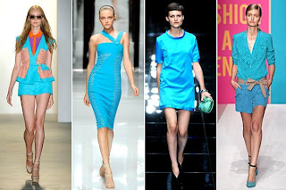
This is one of their versions of blue, and I love how "blue" can cover so many shades. This one struck my eye in particular because of the brightness; it's been a while since I've seen this neon color. Pair this with more subtle tones, add just a touch of it to a jewelry piece, and you have a winner. The Refinery also talked about pairing blue with orange - always a good thing, because they are complementary colors (they are across from each other on the color wheel - thank you, elementary school art teaching!). This means that they will always work off of each other, emphasizing each other. But you have to be careful with the amounts - don't do half one and half the other, that would be too overwhelming for the eye. Pick a major and a minor, and throw in subtle accent colors here and there if it's a large piece. But, to bring it back on topic, blue and orange always look good together, especially a dark navy with the orange. Orange is bright naturally, and a bright blue with it might be too much.
That's it for this new Monday, click here to get started browsing the Refinery. They have much more than ust Spring 2011 color trends, and they have updates regularly. Have a great week, and remember to check back every day for new inspirations!
**Tune in for next week for the first Summer 2011 Fashion Forward! **
Sunday, February 27, 2011
Isinglass
Isinglass, called Glassbead on Etsy, has one of the most fluid, organic styles in glass I've ever seen. Each piece, whether it's a simple leaf or a complex mask (yes, I said mask!), they are full of life and movement. She has hundreds of glass beads from which to choose, and no two are the same. Every pendant, every portal (yes, I said portal too!) is created in a different color, has a different pattern, has a unique extra adornment to it. Her sculptural beads are absolutely fantastic, ranging from her famous fish to cat's and turtles. (All images copyrighted to the artist)


This is the "Portal" bead I was talking about, and I have never in my life seen anything like it. To find a shape that hasn't been done to death in glass beads is incredibly hard to accomplish, but she did! And it's so neat, and the name of it just makes it even more intriguing. I love anything that's mysterious and mythical, and the colors, shape and name of this bead all fall under those categories. She has this is every color patten under the sun.

How adorable is this?? I love how fat and round it is, and she has so much control with the glass that she can get the handles to have those little upturned ends...amazing. The design is so fun too, and I like how she puts so many upraised dots on her pieces. It gives them great texture.

One of her amazing masks! Why wouldn't you buy ones of these? Those lips are great, I had never thought of making lips like that before, with the black underlining them. It gives them great depth. My favorite part are the ears, they're so cute curling up like that :)

One of her famous fish, these little critters come in every color and could fill an aquarium! they're beautifully done, and I especially like the fins. They look like they might start flitting back and forth any second.

Just an example of her skill with swirling, motion-filled patterns. She's great at color combinations (I like this one - pink and black are always great together!), and knows just where to place those final-touch dots.
Saturday, February 26, 2011
For the Cross
The style of this artist could keep me enthralled for years. Forthecrossjewelry creates items using her intuition and skill, resulting in a steampunk, neo-victorian, Renaissance feel. Some items have a skull, others are a fabulously colored gemstone, and some have Alice and the Mad Hatter. You never know what you'll find. Every item, even if it uses the same format or beads, is done in such a way that it stands out from the rest and is absolutely gorgeous. Each piece has it's own voice, and it's a beautiful one. (images copyrighted to the artist)


the colors of this "Dragon Breath" ring caught my eye and lured me into her store. The name helped too:) I love the gold setting with those colors, and she has many more in this same shape with other amazing colors.

How beautiful is this? The Victorian, vintage feel is great, and that picture is so unique. The little clam shell above it cinches the whole picture. I never realized, until looking at her shop, just how attractive a gold setting can be. I'm usually not a fan of warm colors, but I'm going to have to experiment more with them after this.

In the same style as above, but with Alice in Wonderland! You can't go wrong with that in a setting like this. The original drawings lend themselves well to this, and the story does as well. The little tea pots complete the pieces, and she does that so well - those little touches mean everything.

These are just fun. Happy, flowery skulls with roses :)

These are a great, versatile item, and she has them in all colors of the rainbow. Simple, sweet, and chic, these will go with anything this Spring. I adore those bead caps too.
For the quality and technical skill of the pieces, her prices are outstanding. Click here to start shopping right now!
Thursday, February 24, 2011
Wolves + Glass = Awesome
The relaxed, understated atmosphere of this next Etspiration shop is what drew me into their store. A husband and wife team, WolfGlassArt has simple, clean pictures that showcase the color and line of their phenomenal handblown glass pieces. Their store is chock-full of gorgeous items that speak for themselves. Their wares include the traditional suncatcher ornaments, wine-stoppers, vases, dishes, wall art, figurines, lamps, and paper weights. Their use of color is incredible, their shapes are organic (yes, I'm biased towards it), and in the plethora of glass art they stand apart for being completely eco-friendly. (all images copyrighted to Wolf Glass)

This color combination is so cool! I haven't seen orange and black in a long time (outside of Halloween), and I absolutely love it. This is part of their "dragon" series, and all have the same spiral design in black and white. Click here to see a really cool one in the Saint Patrick spirit. The whole piece is shaped like an eye, and the cluster of black and white in the center is perfect for creating this effect. It has a rather hypnotizing effect, drawing your own eye towards it. This would look great on any wall, and they have it in practically any color.

I don't know if I like the color or the shape better. Purple and black is a chic color combination; not something you see everyday, and has the possibility of being done wrong, but when it's done right it's fantastic. The whole piece has a plant-like feel, with the organic black stalks emphasized by the wavery edge of the bowl. The 3-dimensional aspect of the stalks gives the piece extra texture, adding to the appeal. This is also a unique design (as far as I know), separating these pieces from your standard open, wavy-edged bowl. I'm also looking for pieces that are a new take on something traditional, and I like the funky style that they have given this. Again, they have these vases in nearly every color. On the practical side, I like how they put a solid base on the bottom. I hate it when a bowl rocks slightly.

Part of their recycled collection, these pieces are all made from glass that would otherwise have been thrown away. As you know if you've read my other entries, I am a huge fan of recycled art. The environment needs all the help it can get. It's great to see an established glass team putting in the effort to make their work eco-friendly. On top of all that, they made them functional! These are too cute, and what a great idea. I can assuredly say that I have never seen a soap/lotion dispenser made of recycled glass. I like how they aren't perfectly streamlined, either; each has a personality, a little touch of abnormality that makes it unique.


This duo also makes these fabulous wine stoppers. They're simple, lovely, and have that great cane twist in the middle. Simplicity is a key word for WolfGlassArt. They have a masterful control over color and technique and use that to their advantage instead of crowding the piece with an overload of design and elements. Effortless, clean beauty is extremely attractive, and not just in people. We look for it in all things, especially those items that decorate our houses or our bodies.
From the high quality photographs to the skilled technical execution, WolfGlassArt produces beautiful, eco-friendly work. You can sense the effort they put into their work and, if you read their bio, you can tell that they truly want the best for the customer. They rely on their skill with color instead of distraction, resulting in simple, sleek pieces. They have original designs and new spins on traditional items, and that's incredibly important in the explosion of glass art that's happened in the last few years.
They also have a great website that I definitely recommend looking at. It has more items than their Etsy store, and a large section of their recycled glass art. It also has a great section on their glass wall art showcasing some of their larger pieces, which are bright, fun, and full of life. So you have two choices: click here for their Etsy shop, or click here to check out their website first. Either way you have to see both, they're that good!
Monday, February 21, 2011
The Magic Eight Ball of Fashion
We all know that fashion trends are set waaayyyy in advance of the actual season. Fall and winter trends for this year are already out there. Summer is an "over and done with" season.
I didn't realize that summer 2012 is already a done deal. "Le Cuir A Paris", a company that organizes a fair for the top fur, leather, and fabric industry leaders, is one of the heavy-hitters in color trends. Their website already has a "Fashion" and "Color" category for Summer 2012.
More importantly, they also set some trends for Spring 2011. I found an amazing website called FashionTrendsetter that has links to various websites about each season of the year. It's easy to navigate, simple, and to the point. They have a section about Le Cuir with 5 or 6 palettes that they tossed out there for Spring 2011 (with great titles, like Enchanted Picnic). Some are typical spring with bright, light pastel colors and some are more for the summer, but one struck my eye (image copyrighted to Le Cuir):

"Shadowy Shores". It's not what you would expect from a Spring collection, but I love it because it emphasizes those darker days of rain and mist. Standing on the beach, watching the stormy skies and dark waters...
It's refreshing after so many fairytale colors. I think it would translate very well into jewelry, creating understated, muted pieces that don't "pop" like usual. They meld with the clothing, acting as an extension rather than an accessory. Put in a few bright spacers to give it just a touch of brightness, nothing overwhelming. Chunky is best with this palette, since you can put in various versions of the same colors and use analogous colors to give the piece some heft and weight. With such a muted tone, you need something else besides the color to act as the base of the piece. Use a bluish-gray as the base for any beads with the other colors as accents. Large, round beads, not flat, will give it some depth as well. If you go for design, stick with something simple and soft; don't go overboard with the patterns.
Speaking of patterns, I also picked up a copy of the Spring 2011 edition of New York Fashion Magazine:

(yes, that is Jessica Simpson) It's their double issue with a summation of the fashion trends from Fashion Week in New York, but I wasn't that impressed with it because, instead of winnowing everything down and telling us what's in, they basically said "Anything Goes!" Sure, that might be the case, but SOME direction would be nice! All colors of the rainbow are in, whites are in, punk is in, nude colors are in, denim is in (unfortunately), even feathers. "Vogue Paris" put out this cover:

Which confirms New York's Report (I will unabashedly take a Parisian's word about fashion over a New Yorker's). Strong, solid colors that pack a punch on their own. Put it in your jewelry and you've got a home-run. People love beautiful simplicity, even more so when it's in style.
The one area I could find a slight direction in the New York magazine was patterns: "Go big or go home", as one of my friends likes to say. If you're going to go for a pattern, make it worth it.

These are from Rodarte during Fashion Week. I like the white with the blue pattern, very Ming of them. Note the recurring theme of loose and flowing...see my Spring Part 1 for some ideas on how to pair this with jewelry. With a pattern like this, I would put a simpler piece of jewelry. Plain beads, one strand, a watered-down version of the pattern, something that isn't so complex it looses itself in the clothing. You want it to stand apart.
I've also been seeing a ton of high-necked fashions, and I am not a huge fan of the necklace over the shirt, so I am going to focus on earrings a bit more than I would normally. You can go as crazy as you want with earrings when they aren't competing with a necklace for attention.
But for the season, I'd say the bracelet is going to be the most important accessory.

So remember: Big, Bold, Simple. Whether it's patterns or solid colors, don't wimp around.
Sunday, February 20, 2011
My Lucky Leprechaun
I had to post this because I'm actually rather proud of this little guy:

Isn't he adorable? A little leprechaun to help you keep your wine fresh. Imagine a whole troop of them lined up in their bottles...

Here's the link to the store to see a few more images of him:
Bringing Home Baby
Adorable. Cute. Chic. Words you think of when you see this next artist's creations for children and their devoted mothers. AnnelynDesigns is an accomplished painter, seamstress, and designer. She makes items ranging from acrylic paintings for the baby's room to hip clips for pacifiers to baby carriers. All of her items fit either girls or boys, and the items for mothers are super fun and will bring a smile to the face even when confronted with a bare bottom.


Annelyn's avatar for a reason, this is my favorite picture in her collection. Isn't that zebwa just swo cwute? (Baby talk just comes naturally to me when looking at adorable baby animals...) And not only would your child be surrounded by lovable animals, but by fine art as well. This is an original acrylic painting by Annelyn, for an amazing low price. She has a whole set of these animals, check out this fierce one:

Their poses are so cute, with their big feet and round tummies.

This is a really neat item that I've seen on women but never knew the name. It's called a Mei Tai, and it's one of those slings in which you carry your baby. She has added her own original design: the detachable hood turns into a drawstring pouch to actually store the Mei Tai in, which is super convenient. She uses one herself, and the children fall asleep right away. Not only that, but it is the most comfortable carrying device for the mother too. The awesome pattern will add some spice to it too!

A little apron for your budding chef! The colors are fantastic and the flowers are beautiful accessories. Your child will want to wear this all the time! She hand sews all her items. I love the ruching on the bottom too, and the blue spotted trim.
Annelyn has tons of other items in all sorts of patterns, so start browsing her shop right now!
Saturday, February 19, 2011
Recycled Art
I absolutely LOVE this next artist. WVglass takes old glass bottles that would normally be thrown away and makes them into long-lasting household items. Glass bottles become tumblers, candle holders, vases, clocks, serving trays, and more. Anything that helps the environment is great in my book, and not only are these items functional but they're beautiful. I have a thing for beer and wine labels, and this is the perfect look for me. (All images copyrighted to the artist)


Instantly my favorite, this design is awesome. I love the labels on the Chianti bottles, and the size. I never understood the need for a tiny "juice glass" that fits one swallows-worth of liquid :)

Such a great idea! The green color is lovely, and the wire design she put on them makes them pop. She even has the creativity and skill to cut the tops on the diagonal, which makes them even more chic.

Like I said, all sorts of items! A desk lamp with a beautiful design. I never realized how pretty some bottles are, until they're used for something else. I guess you don't really notice it when you throw it away after you're done with it.

A beautiful set, imagine this out by the pool in the summer. She hand-cuts all her own bottles, so you're guaranteed to have a smooth finish (pun intended!).
Support the environment: Click here to start browsing her shop!
Friday, February 18, 2011
Gettin' Me Some New Threads
We all have to wear clothes (generally speaking): why not make them unique and exciting? Causticthreads takes the plain old T-shirt and ramps it up ten notches. She makes her own drawings, burns them, and prints them on the T-shirts. She's got a great, loose style that's edgy and hip without trying too hard.


Aren't they so cute? I love this one, the fawn is adorable. It says "I love you" in Spanish.

She also makes onsies for the little ones! This is for a "Batty Baby"...I love her sense of humor.

Whimsical but to the point. It conveys the message better than any box of chocolates.

Arm warmers, just one of many products she carries. Click here to get started browsing her shop, I guarantee it will keep you occupied for hours! She has an item for every occasion, a print for every holiday. Enjoy!
Thursday, February 17, 2011
O'Neil's Art
~Etspiration Day~

Catches your eye instantly, doesn't it? Not only are the colors a great match for each other, but the pattern is incredible. It reminds me of a seashell, and the colors add to that summery, watery feel. The pinwheel pattern is not flat and straight, but flowing and you get the sense of being pulled through the yellow faster and faster and faster until you reach the very center. Once you move beyond the impact of color, you see that the shape of the vessel enhances the pattern. The edges are like ripples in water; it looks much better with the piece than a straight edge would. It allows the eye to enter into the pattern and follow it all the way to its tightly wound center.

A fantastic shape! The starburst effect is so beautiful and pleasing to the eye. The color pattern again is set just right, so that it's not too overwhelming for the viewer. The colors are beautiful, and the crevices in the shape allow for a natural change in color. I believe that the less you force the glass the better, so I love how this piece utilizes the bends in the glass to create color instead of adding a whole new color. And again, that swirl-into-the-center pattern is wonderful. The edge is interesting, and keeps the viewer interested longer than a plain straight edge would. Like all his pieces, this has a big, bold personality.

A different shape but still in the same style as the rest. I'm a fan of this shape, with the big fat upper bit narrowing suddenly into the flat top. These remind me of peacock feathers, but the purple packs an extra punch. His use of pattern is evident again here; he knows just how to work the pattern so it flows smoothly and doesn't look forced. I tried glassblowing once, and had to put frit on the piece to create a color pattern, and let's just say it didn't turn out the way I had hoped. More like a mash of color with no clear pattern behind it. Humans enjoy patterns; they find them harmonious and soothing to the mind, and follow them easily. It can make or break a sale for a customer. Oneilsarts can masterfully create them.

I had to include this one because it contains all colors that I don't really like but for some reason I find this piece irresistible. The ribbed effect is so pleasing to me aesthetically, and the edge's exciting fluid motion is great. I imagine it sitting in the ocean, the egdes wafting gently with the currents, like a sea fan. The darker areas provide enough of a color difference to keep the piece interesting. I also like how the pattern is different from the rest; no swirl, just an ever-increasing starburst coming up from the center. I can't decide which pattern I like best.

This is like a combination of both patterns. The starburst in the middle and the winding pattern on the edges. I can't tell you how much I love the colors in this piece. It's like jumping into the ocean, or looking up though the water at the sun. The rounded edges prevalent in the pattern are soothing, and the softly meandering edge contributes to that effect.
All of his works would look fantastic on the wall, and provide a great backdrop in a summer or beach house. His use of color reminds me of the ocean, of water, and color and sun and all things good. No piece set my teeth on edge, as bright colors and patterns have the potential to do, and each has an organic, natural flow to it. It seems like he is working with the glass instead of against it, and I appreciate that.
If you read his profile, you can see that he has always had an appreciation for art, and it shows in his work. He has an extensive background in glass art, his studies including the prestigious Pilchuck Glass school, and has apprenticed for many well-known artisans. Has has even begun to expand the possibilities of glass by combing pieces with hand-forged metal works. This is someone who has devoted his entire life to his art; that requires an incredible amount of passion and excitement, which is reflected in his work. Each contains a spark of life, of that intense energy that created it. It lingers, creating an aura around each piece, and the viewer can feel it. Every work has a personality ; if you look through his shop, no two pieces are the same.
Any work of art that has that "spark" is worth purchasing. That's the best part about handmade; you feel as though you are a part of the creator, that you have a connection with him or her. Oneilsarts accomplishes that, in a beautiful and natural fashion. Click here to see his Etsy shop and begin the visceral experience!
Wednesday, February 16, 2011
Creative Concoctions
Today's artist is a fabulous New Zealander called CreativityJewelry. She delivers on her name, designing gorgeous Victorian-inspired wire work jewelry mixed with gemstones and pearls. She uses mostly copper, resulting in a stronger antique look, which I love. Her pieces are clean, delicate, and unique. You won't find any of these in a store! (all images copyrighted to the artist)


Wouldn't you feel amazing having these dangling from your ears? The purple and copper go so wonderfully together, and the wirework is masterful. I love the lattice design how she added the beads to the side of the wire. And check out the photography - its the perfect backdrop, adding to the Victorian feel of the jewelry.

The colors on this piece got me. I really like simple chain necklaces that have a cluster of beads. She only uses the best materials, and it shows. Again, the copper goes so well with the colors - I'm definitely going to have to use more copper. Her backdrop is great, and is soft enough that it doesn't detract from the piece itself.

Her bracelets and cuffs are great too. I like this one because it shows off her wirework, and the placement of the two gems is very harmonious to my eye.

I had to add this in because she makes the most beautiful garters I have ever seen! If you're getting married, pick up one of these for sure! She also has matching sets of jewelry for bridesmaids in gorgeous crystal colors; check them out here.
I also have to mention how nice CreativityJewelry is; she's incredibly friendly, helpful, and modest. Her bio is very professional but personal; you get the sense that she only wants the best for her customer and will do anything to make their experience the best it can be. What are you wiating for? Click here to browse her large collection of artisan jewelry!
Tuesday, February 15, 2011
SaiSai Sensations
I found this artist through her blog when I clicked on "Next Blog" and landed on her old blog, which had a link to her new one, and I'm so happy that I did. Saisai creates mixed media jewelry, accessories and paintings with beautiful, sparkly, and feathery objects. I love her asthetic. I am particularly fond of her wood paintings that are embellished with found objects; I've never seen that before, and the contrast between the 2 and 3-D is great.


"Welcome Spring". This caught my eye INSTANTLY. It just popped right out. Not only is the painting gorgeous and very skillfully executed, but the embellishments are placed in just the right spot and aren't overwhleming the picture. It would be very easy to overdo it with that large flower, but she managed to place it so that it accents rather than dominates.

"Cote d'Azure" - One of the things I love about her work is the description of her piece. Check out the one for this item and you'll find a succinct, interesting story of how it evolved. It gives the buyer a chance to connect with the piece, and it's hard not to when she uses such eloquent and lovely language! Now on the actual piece - the colors are beautiful, and I love how it is truly one-of-a-kind. Again, it's simple enough that it's not just a mish-mash of items.

Another of the wood paintings with found items, "On Vacation" will add a bit of chic style to the room. It packs a big punch for its small size. You can feel the personality of this lady. The colors are great, the dark under the chin really sets off the rest of the piece. If you're looking for a conversation piece or something to give a room a "feel", this is definitely it.
I'll mention her website again because it's really well done. Not only does it have a blog, but it has her art and all the services she offers, which includes graphic design. And how can you not like her with a name like "Sai Sai?"
Monday, February 14, 2011
Honey Lovin'
<3 Happy Valentine's Day <3
In the spirit of the day, this post is all about the love affair the fashion world has with its new baby: Honeysuckle.
Everywhere I love I see reports for Honeysuckle being the new spring color. Not only has Pantone, that fabulous one-stop color report, plastered it all over their site, but even Firemountain Gems (who are fantastic for jewelry supplies, by the way!) sent out an email with it as their top color for the whole YEAR. Here it is in all its glory:

Very unassuming, isn't it?
But it's packing quite a punch. Here are some examples from the runway (all pictures copyrighted to the respective artists):

From Badgley Mischka, this is beautiful, light, and full of movement. The soft pink isn't so pale it looses its color, and it isn't so bright it hurts the eyes. It's just right. Pair this with jewelry that has loose chains woven in with the beads, one or two dangling charms, or a single bead on a long chain.

A slightly darker version of the Honeysuckle, this is from Nanette Lepore. Again, it's loose and flowing, but gives a nice neckline for a stellar piece of jewelry. The bare arms are begging for a bracelet, maybe a few stacked together. I love the texture at the bottom; try working that lined look into your beads!

I love this collection by Tadashi Shoji (http://www.tadashishoji.com/#app=eb7b&9526-selectedIndex=1&cc00-selectedIndex=0&bb6-selectedIndex=0&f5fe-selectedIndex=0). You can see all the honeysuckle pieces he has. The wrap look is back, with the pleats going diagonal, which slenderizes the silhouette. Not much neckline going on, but plenty of room for a bracelet.
Pantone also has a few runner up colors that are considered part of the 10 colors of spring (plus Honeysuckle):

You can find descriptions of each color here, on Pantone's website.
As for the glass side of things, I have found a combination that I love for Honeysuckle. I tried using just Gelly's Sty, a pink color by Messy Color, but it was too light and pale pink. So I tried adding a layer of Light Transparent Amber, but that just washed it out even more and made it a peachy color. Then I hit it: put a layer of LightTransparent Amethyst and voila! You get Honeysuckle (images copyrighted to Mountain Glass).

Plus

Equals

It has more dark purple undertones in real life; I still have to fiddle around with the light colors in photoshop. They're harder for me to represent in true color through a photo. It's a shade lighter than the honeysuckle in the Pantone lineup.
Another option that I haven't tried is Crocus from Messy Color:

This might be a winner on its own; no need to add a color over it. Let me know if you've tried it and how it was!
To sum up: Pantone rocks when it comes to a legit, definitive source on color trends for the coming seasons. If you can only pick one website to go to, pick theirs. They have links to tons of fashion designers who have designed clothes with those color schemes, and you can plan out your jewelry by matching it to some of the outfits.
Make sure you have some Honeysuckle in your diet this spring. If it's on the runway, the ladies will want it.
Subscribe to:
Posts (Atom)