This is their "earthy" tones, and I love them. I am not a fan of bright reds and oranges, and this tones them down enough for my eyes not to hurt. I think adding in a hint of a dark cool color, like a stoney blue or green, or even better a gray stone laced with those colors, would look gorgeous in any jewelry. Browns, ambers, and antiqued golds should form the large chunk of color in the pieces. Copper accents would be perfect, and help ailments (just a plug for the health benefits of copper!).
On a general note, I'm feeling copper as the new findings favorite for this year. I think we've done silver and gold to death, and people are looking for something hip and new. Gunmetal and black findings are on the horizon as well, though more confined to the "trendy" young pieces than the mainstream stuff.
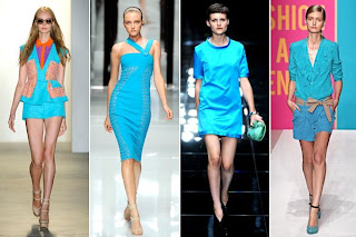
This is one of their versions of blue, and I love how "blue" can cover so many shades. This one struck my eye in particular because of the brightness; it's been a while since I've seen this neon color. Pair this with more subtle tones, add just a touch of it to a jewelry piece, and you have a winner. The Refinery also talked about pairing blue with orange - always a good thing, because they are complementary colors (they are across from each other on the color wheel - thank you, elementary school art teaching!). This means that they will always work off of each other, emphasizing each other. But you have to be careful with the amounts - don't do half one and half the other, that would be too overwhelming for the eye. Pick a major and a minor, and throw in subtle accent colors here and there if it's a large piece. But, to bring it back on topic, blue and orange always look good together, especially a dark navy with the orange. Orange is bright naturally, and a bright blue with it might be too much.
That's it for this new Monday, click here to get started browsing the Refinery. They have much more than ust Spring 2011 color trends, and they have updates regularly. Have a great week, and remember to check back every day for new inspirations!
**Tune in for next week for the first Summer 2011 Fashion Forward! **


No comments:
Post a Comment