<3 Happy Valentine's Day <3
In the spirit of the day, this post is all about the love affair the fashion world has with its new baby: Honeysuckle.
Everywhere I love I see reports for Honeysuckle being the new spring color. Not only has Pantone, that fabulous one-stop color report, plastered it all over their site, but even Firemountain Gems (who are fantastic for jewelry supplies, by the way!) sent out an email with it as their top color for the whole YEAR. Here it is in all its glory:
Very unassuming, isn't it?
But it's packing quite a punch. Here are some examples from the runway (all pictures copyrighted to the respective artists):
From Badgley Mischka, this is beautiful, light, and full of movement. The soft pink isn't so pale it looses its color, and it isn't so bright it hurts the eyes. It's just right. Pair this with jewelry that has loose chains woven in with the beads, one or two dangling charms, or a single bead on a long chain.
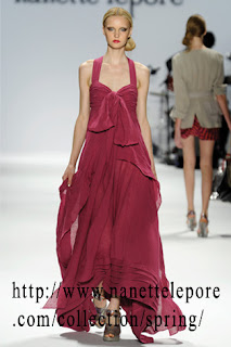
A slightly darker version of the Honeysuckle, this is from Nanette Lepore. Again, it's loose and flowing, but gives a nice neckline for a stellar piece of jewelry. The bare arms are begging for a bracelet, maybe a few stacked together. I love the texture at the bottom; try working that lined look into your beads!

I love this collection by Tadashi Shoji (http://www.tadashishoji.com/#app=eb7b&9526-selectedIndex=1&cc00-selectedIndex=0&bb6-selectedIndex=0&f5fe-selectedIndex=0). You can see all the honeysuckle pieces he has. The wrap look is back, with the pleats going diagonal, which slenderizes the silhouette. Not much neckline going on, but plenty of room for a bracelet.
Pantone also has a few runner up colors that are considered part of the 10 colors of spring (plus Honeysuckle):
You can find descriptions of each color here, on Pantone's website.
As for the glass side of things, I have found a combination that I love for Honeysuckle. I tried using just Gelly's Sty, a pink color by Messy Color, but it was too light and pale pink. So I tried adding a layer of Light Transparent Amber, but that just washed it out even more and made it a peachy color. Then I hit it: put a layer of LightTransparent Amethyst and voila! You get Honeysuckle (images copyrighted to Mountain Glass).
Plus
Equals
It has more dark purple undertones in real life; I still have to fiddle around with the light colors in photoshop. They're harder for me to represent in true color through a photo. It's a shade lighter than the honeysuckle in the Pantone lineup.
Another option that I haven't tried is Crocus from Messy Color:
This might be a winner on its own; no need to add a color over it. Let me know if you've tried it and how it was!
To sum up: Pantone rocks when it comes to a legit, definitive source on color trends for the coming seasons. If you can only pick one website to go to, pick theirs. They have links to tons of fashion designers who have designed clothes with those color schemes, and you can plan out your jewelry by matching it to some of the outfits.
Make sure you have some Honeysuckle in your diet this spring. If it's on the runway, the ladies will want it.


No comments:
Post a Comment